My Type of Town
Seattle, Washington 2007-10-28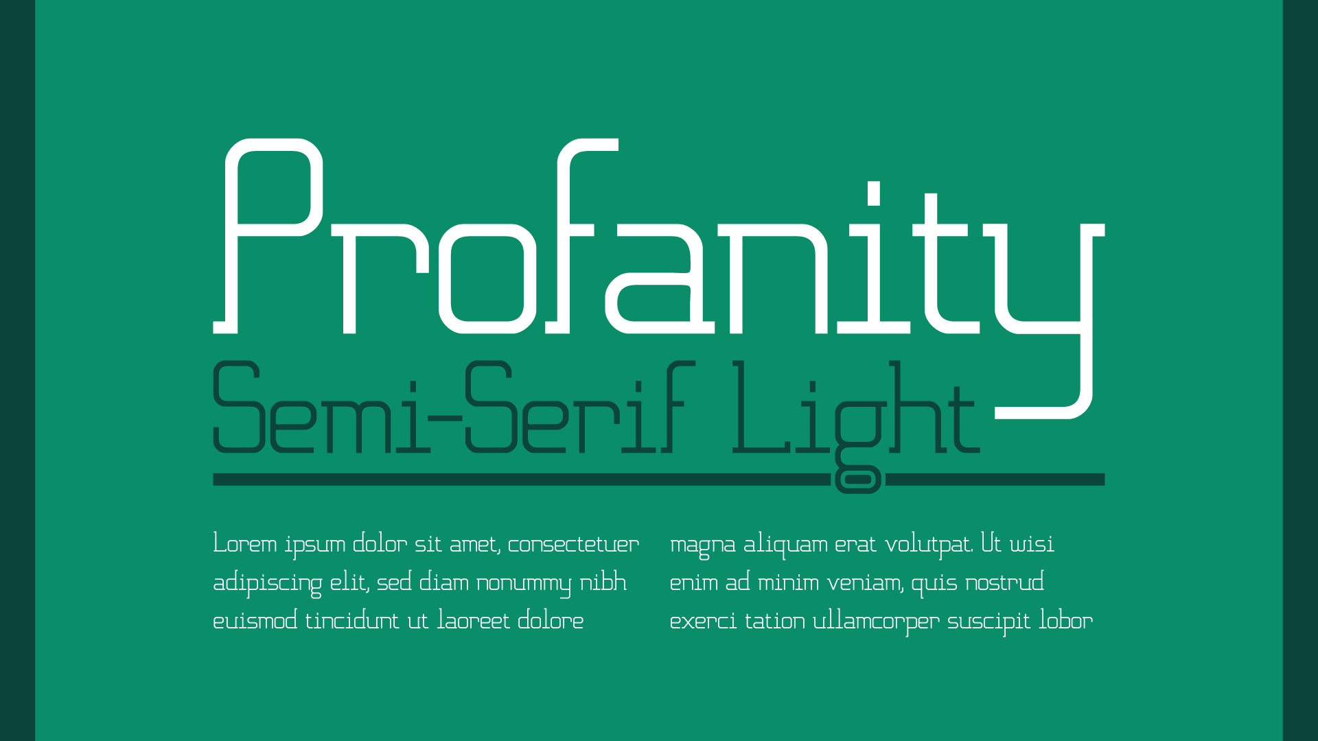
Description
For the Typography I assignment “My Type of Town”, I was tasked with creating a typeface for Seattle’s First Hill neighborhood, also known as “Profanity Hill” and “Pill Hill”. The result is Profanity Semi-Serif Light.
Design
Inspired by the rich cultural and economic history of Seattle’s First Hill, “Profanity” attempts to fuse several of the neighborhood’s widely diverse identities into one cohesive typeface. The two-story design of the lowercase “g” and “a”, for example, speak to First Hill’s aristocratic days around the turn of the 19th century, while the clean, geometric approach of its construction references the hill’s long-standing role as a clinical and medical epicenter.
The core component used in Profanity’s creation is the highly rectangular lowercase “o”, around which the rest of the glyphs were designed on a regimented grid. This relatively mechanical approach was supplemented by optical adjustments where necessary to make the face as balanced, functional and graceful as possible.
Font
While the assignment only required designing a limited set of characters, I decided to attempt to design a full font. The result is a bit rough, but the TTF file is available for download.